


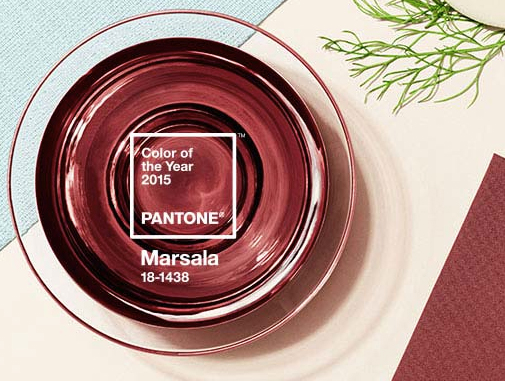
Every year Pantone sets the trend for colors in print design, marketing and advertising, interior design and many other industries by announcing their color of the year. Well, Pantone just released the Pantone color of the year for 2015: Marsala Pantone color number 18-1438.
What is Pantone and the PMS Matching System?
Pantone “is the world-renowned authority on color.” They provide color systems for various industries and are most known for their Pantone Matching System (PMS). The Pantone Matching System is a way of standardizing colors in the CMYK coloring process. CMYK stands for the four colors used in full color printing. Layers and combinations of the CMYK colors create full color images and print. The colors are cyan, magenta, yellow and black. The PMS system provides the correct mixtures for color matching. PMS colors can also be translated into RGB. RGB (red, green, blue) are screen based colors. For example your television and computer screen use the RGB model.
Why is PMS matching important?
PMS colors are significant to the promotional products industry. We use Pantone colors on a daily basis when imprinting custom items with logos and marketing messages. PMS matching is important to corporations who have specific colors as part of their corporate identity. At times it is necessary to come “as close as possible” to the PMS color of the imprint. There are many reasons why you may not be able to get an exact PMS match. For example some reasons may be the color of the item that the ink is being placed on or PMS matching is sometimes not available. In many cases to save on cost businesses may choose to come “as close as possible” to avoid a PMS matching fee.
Why is Marsala the Pantone color of 2015?
Marsala is full of richness like fortified wine. It’s earthy and warm which gives off a feeling of satisfaction and comfort. Marsala is also an Indian spice and it is a bold and radiant color. As shown in the video, Pantone describes Marsala as robust, earthy, sophisticated, hearty, stylish and fulfilling.
The Importance of Color in Branding and Advertising
As mentioned above color is important to corporate identity. It helps you remember a brand such as the brown UPS truck, red Target shopping carts or the bright orange Home Depot work buckets. The brown UPS truck represents dependability. The red Target shopping carts convey a feeling of excitement and represent bargain shopping. Orange for Home Depot represents construction and building. A brand with consistent color across it’s marketing increases brand recognition by 80 percent.
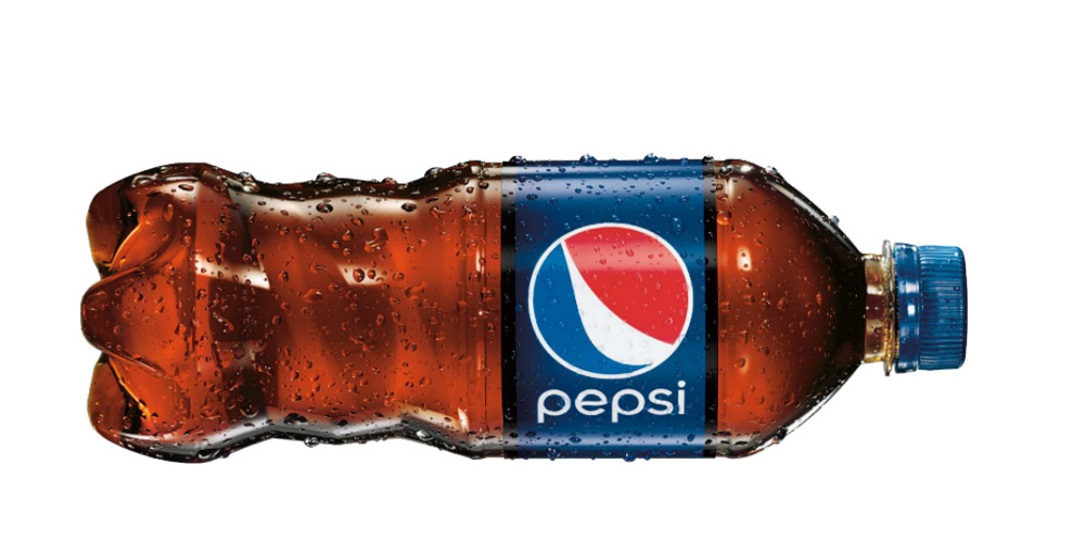
Color is also a good way to categorize products or services. For example, you can easily differentiate FedEx express (purple and orange) and FedEx ground (purple and green) by their colors. Did you notice that both FedEx services use purple?
Color is important in branding and advertising because of it’s psychological impact. Use the right color to convey the right feeling. Color is also important for recognition.
How do you use color in your marketing? What do you think about the Pantone color for 2015? Do you like trying different colors or do have a certain color you stick to? What’s your personal favorite color? Will you use Pantone Marsala in your design or advertising this coming year?

 Sleep helps the brain. Chronic sleep deprivation can cause weight gain. Lack of sleep can also affect your mood. How can you turn those bouts of insomnia into creative ideas for promoting your company? We are going to help you make use of your insomnia by using that time to come up with brand ideas.